Nashville Predators
Nashville Predators
Nashville Predators
Pride Night Design
Pride Night Design
LGBTQIA+ meets Bridgestone Arena
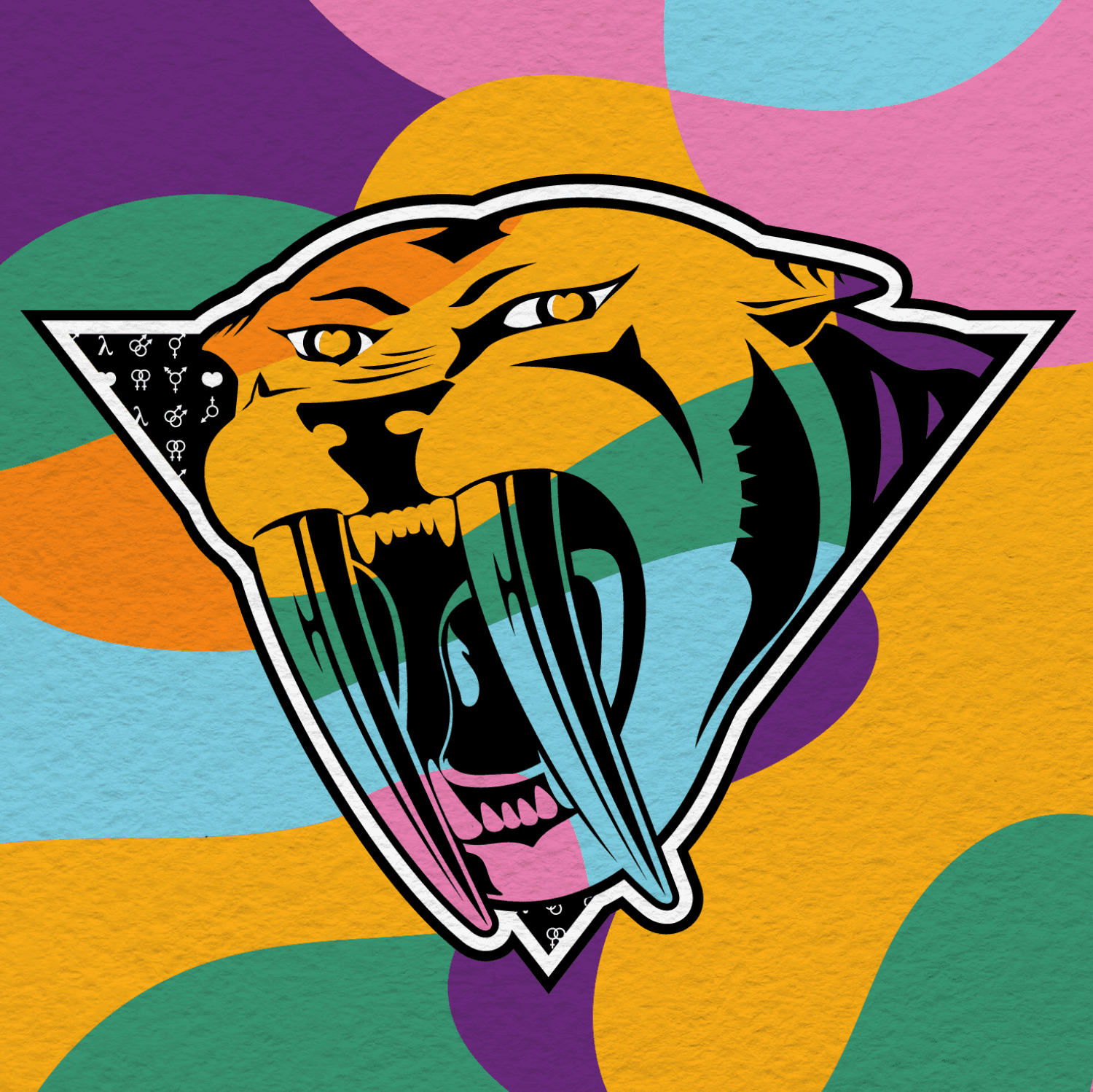

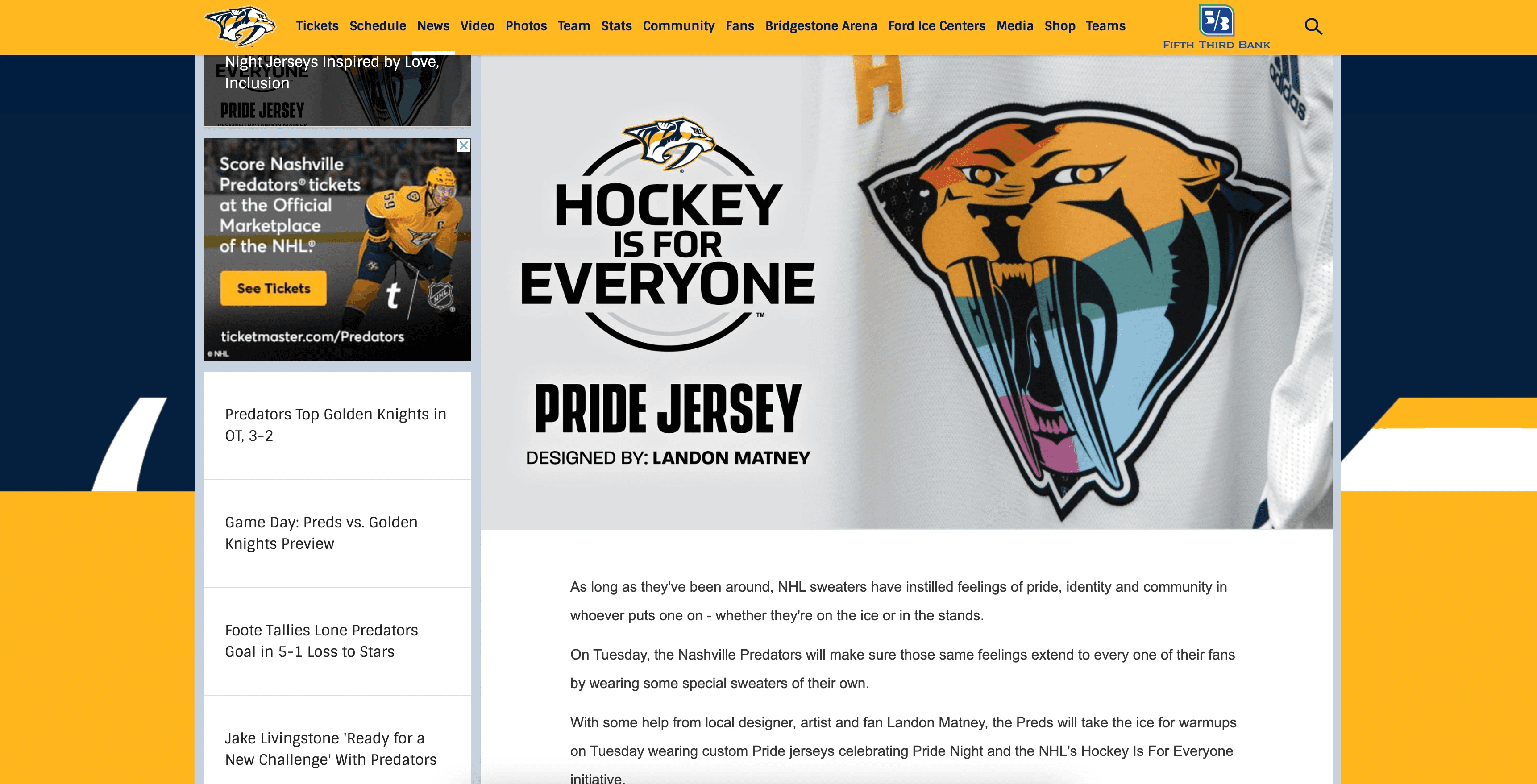
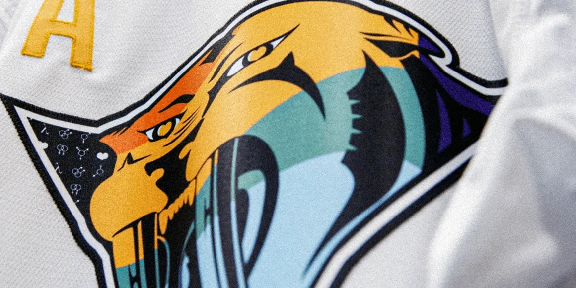
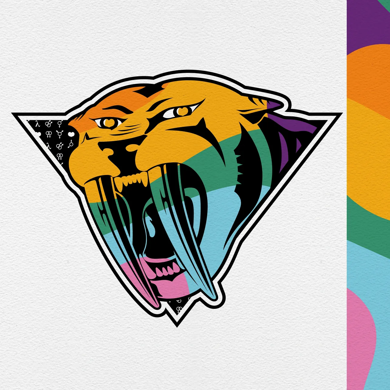
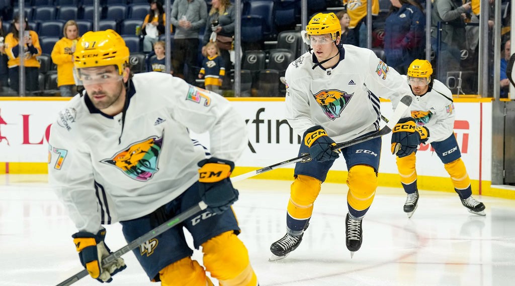
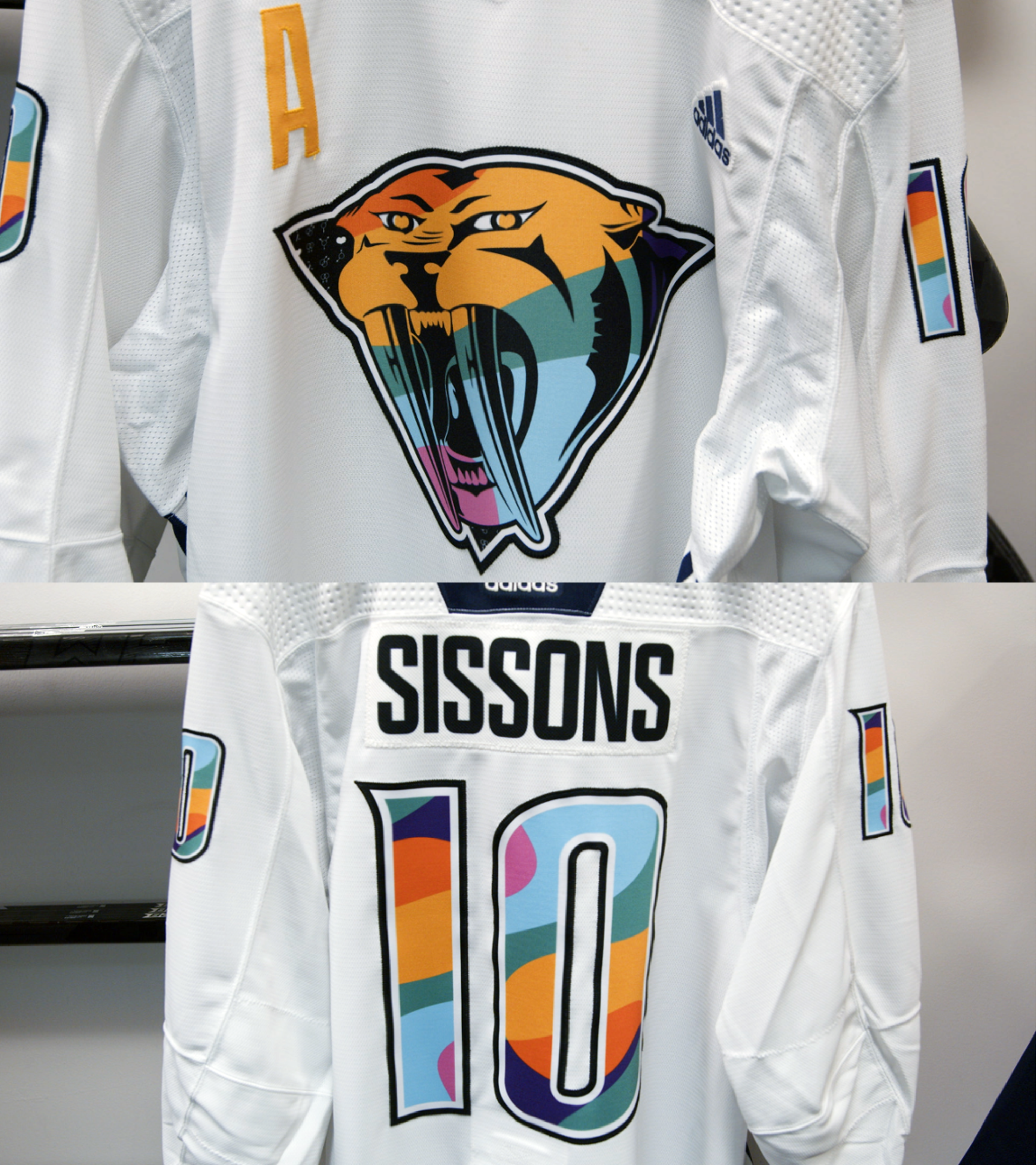

Commissioned to design the Nashville Predators’ Pride Night jersey, I developed a concept that honored both the team’s legacy and the spirit of the LGBTQIA+ community. After exploring multiple creative directions, the final design embraced a vintage treatment of the Predators logo with meaningful symbolic alterations throughout the jersey. Most notably, the sabertooth tiger’s eye slits were reimagined as golden hearts—a subtle but powerful gesture of inclusion and visibility. Additional heart motifs appear within the triangle border alongside gay, lesbian, bisexual, transgender, intersex, and lambda iconography, with the lambda symbol long recognized as an emblem of LGBTQ+ civil rights. The design direction extended far beyond the ice. It informed the arena’s environmental graphics and supporting print materials, creating a cohesive Pride Night experience from entry gates to concourse. The artwork was also adapted into a limited series of Nashville Predators Pride shirts sold through the team, and in the years that followed, players wore these shirts while participating in Nashville’s citywide LGBTQ+ pride parades—allowing the design to live on as a visible symbol of allyship and community engagement beyond the original event. Seeing the work carried into the arena, into the community, and into future Pride celebrations was a career-defining moment and a meaningful opportunity to contribute to a project rooted in representation, visibility, and belonging.
Commissioned to design the Nashville Predators’ Pride Night jersey, I developed a concept that honored both the team’s legacy and the spirit of the LGBTQIA+ community. After exploring multiple creative directions, the final design embraced a vintage treatment of the Predators logo with meaningful symbolic alterations throughout the jersey. Most notably, the sabertooth tiger’s eye slits were reimagined as golden hearts—a subtle but powerful gesture of inclusion and visibility. Additional heart motifs appear within the triangle border alongside gay, lesbian, bisexual, transgender, intersex, and lambda iconography, with the lambda symbol long recognized as an emblem of LGBTQ+ civil rights. The design direction extended far beyond the ice. It informed the arena’s environmental graphics and supporting print materials, creating a cohesive Pride Night experience from entry gates to concourse. The artwork was also adapted into a limited series of Nashville Predators Pride shirts sold through the team, and in the years that followed, players wore these shirts while participating in Nashville’s citywide LGBTQ+ pride parades—allowing the design to live on as a visible symbol of allyship and community engagement beyond the original event. Seeing the work carried into the arena, into the community, and into future Pride celebrations was a career-defining moment and a meaningful opportunity to contribute to a project rooted in representation, visibility, and belonging.
Nashville Predators
Nashville Predators
Pride Night Design
Pride Night Design
Year
Year
2024
2024
Credits
Credits
Jackie Fisher (Predators Associate)
Jackie Fisher (Predators Associate)